May 11 arrived. With it came iOS 26.5 and that promised end-to-end encrypted RCS stuff. Important. Sure.
But November’s iOS 26.1 dropped a quieter trick. A way to fix the eyesore.
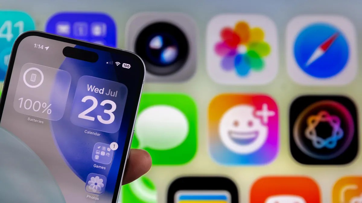
Apple brought Liquid Glass in September alongside the initial iOS 26 rollout. The first visual shake-up since iOS 7 back in 2013. Radical? Maybe not to Gen Z. Revolutionary? For the rest of us, it’s a lot.
Before the November patch, options were sparse. You had the home screen dark tint or you toggled Reduce Transparency across the entire system. All or nothing. Reddit users were screaming about readability. The glass was too… glassy. Too blurry. Too much.
iOS 26.1 changes that. Now you can tweak specific zones. The Notification Center? Fixed. Search bars? Opaque. The Home screen stays the way Apple wanted it.
How to find it:
- Open Settings
- Go to Display & Brightness
- Tap Liquid Glass
Two choices. Clear and Tinted.
Clear is the default. It lets content bleed through the interface layers. Tinted? That adds opacity. More contrast. Apple’s own help text notes it “reveals content beneath” while Tinted “adds more contrast.”
It doesn’t kill the glass effect entirely. Not yet. But it dulls it. The Messages search bar turns semi-solid. It only goes translucent when you hover over something bold or colorful.
Think of it like a frosted window. Less see-through. Easier to read.
Your Light and Dark modes still exist. They run parallel to these new glass settings. You can be in Light mode with Tinted glass. You can be in Dark mode with Clear glass.
My take? Dark mode. With Tinted enabled.
It’s clean. It’s sharp. The visual noise stops screaming for attention.
What do you think? Is the glass too thick? Too thin?
We’ll see how the next update handles it. For now, at least the text stays put.